[Chinese Packaging Network News] Layout is the basis of graphic design. Diagonal layout is much more flexible and difficult to grasp than conventional symmetric composition. The sloping layout division itself has a sense of instability. Dividing the space into two or more blocks on a plane can give the layout a stronger sense of rhythm.
Xiao Bian specifically collected 21 exquisite packaging designs from abroad. All of them are based on diagonals as the main design elements. Look at how creative designers in other countries express their creativity.
NUMERO UNO Coffee
â–½
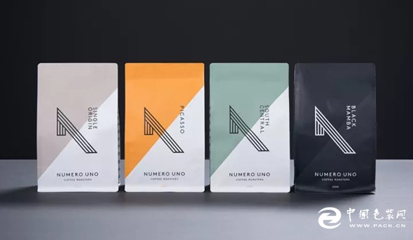
This is a group of modern coffee packaging, tough lines, minimalist typesetting, bold color matching, everywhere highlight the brand's confidence in their own products.
VERVE coating
â–½
A MARI Gin
â–½
The chamfered packaging design was inspired by the waves' undulations. The combination of dark blue and bronze fonts represents the integration of the ocean and land, demonstrating a strong Mediterranean style.
Chapman's Brewing Co Beer
â–½
Culebra-cut beer
â–½
Design Papers Printing Paper Products
â–½
This is a sample package from an old European paper production company. Divided into two colors by diagonal lines, the title in the middle diamond intersects two areas. The upper left rose area icon emphasizes interactivity. The icon on the turquoise background on the lower right corner shows its excellent quality.
Joseph Wesley Black Tea Black Tea
â–½
UTOPICK Chocolate
â–½
Cafe Diego Coffee
â–½
CANTIZAL Olive Oil
â–½
El Cantizal is a well-known Spanish olive oil, packaged in exquisite glass bottles, marked with home signs and certification marks. Traditional elements come with brand new layouts and fonts. Yellow as the main color encloses the entire tag diagonally. Retro yet modern.
DEUTSCHE ERBSCHAFT German Beer
â–½
3922 olive oil
â–½
MAFFRA Cheese
â–½
Rawcha Ice Cream
â–½
The Marshmallowist Marshmallow
â–½
The creative packaging shows the color and texture of marshmallows, and the hexagonal hollow effect meets the brand's interesting and colorful core values. Diagonal-cut geometric color blocks will promote the brand to high-end boutique brands.
MASTERS BAKERY Spices
â–½
Each spice has its own name, which is derived from some famous dramas. For the theater lovers, it is easy to appreciate the fun, even those who are not familiar with the drama will love these beautiful bottles.
Brown Sugar 1ST. Candy
â–½
POM POM Underwear
â–½
LANDER cable
â–½
The diagonal design of the package, from the logo extended auxiliary graphics, in order to maintain the minimalist, modern retro, value and travel brand theme, the use of delicate white Yamagata images, clean geometric lines and retro print style.
ANTAGONIC gin
â–½
Thatchers Orchard Cut Gin
â–½
Thatcher cider itself has a unique, very special development process. In order to reflect the uniqueness of cider, designers have designed a unique label shape, and the material is also the use of logs. Each bottle has its own unique label.
After reading this wave of recommendations, is it also like Xiao Bian, was convinced by the designer's design skills. If you do not want your layout to look too dull and boring, try these diagonal typography design techniques.
Buffet Display Series,Buffet Display Series Docking Station,Buffet Tableware,Commercial Juice Dispenser Machine
Jiangmen Junerte Stainless Steel Kitchenware Co.,Ltd , https://www.jetkitchenware.com