â—Ž When people observe various objects in the outside world, the first thing that causes reflection is the color pole, which is the visual information symbol that is most sensitive to visual stimuli and most responsive in visual elements of the human body. Attention to color accounts for about 80% of human vision, and attention to shape only accounts for about 20%. Color plays a decisive role in the packaging and decorating design.
People in the store are attracted to their attention, and can draw their attention to nothing more than the impression of color is the most memorable.
1 color classification; color is divided into primary color, inter-color, complex color, complementary color four categories.
In the color can not be decomposed, and can be deployed with other colors, such as red, yellow, blue, which is the primary color, that is, the three primary colors. A color that is made by mixing two original tones is called inter-color, such as red and yellow are orange, yellow and blue are green, and blue and red are purple. Duplex color is a color that is made up of two inter-colors such as orange, green, orange, and so on. Complementary color refers to an inter-color between the primary colors, or a color that matches the complex color. The above four colors, in turn, are also referred to as the first color (primary color), the second color (inter-color), and the third color (the complex color), and the complex color may also be called the inter-color.
2 The three elements of color; the three elements specifically refer to the hue, purity, and lightness of the color. They have different properties.
Hue refers to the appearance characteristics of colors and their differences. The color of the light wave due to different wavelengths acts on the human retina, and people experience different colors. Hue specifically refers to red, orange, yellow, green, cyan, blue, and purple. Their wavelengths are different, with red, orange, and yellow light waves that have a strong impact on human vision. The blue, green and violet light waves are short and the impact force is weak. Hue reflects the inherent color and warmth of things.
Purity refers to the degree of pigment saturation. The purity of color reflects the sense of quantity of things, and their purity is different. That is, high-purity color and low-purity color show different senses of things. Red, orange, yellow, green, blue, blue and purple are the highest purity. In each color, such as red, vermillion, pink, and blush, the purity is lower than that of red, and the purity between them is also different.
Brightness refers to the extent to which the color is dark and light. All colors have a difference between light and dark levels. This level is "black", "white" and "gray". Among the seven colors of red, orange, yellow, green, cyan, blue, and purple, the brightest of the brightest colors is yellow, orange, and green, red and green are again, and the darkest are blue and purple. The change in color brightness, that is, the change in depth, makes the color layered and has a three-dimensional effect.
3 the nature of color; different colors, its light waves on the human retina make people feel different, so face different colors people will produce cold and warm, light and shade, light and strong, strong and weak, distance, expansion and contraction and other different psychological reactions .
Cold and warm colors. Green, blue, and purple can give people a feeling of quietness and coolness that resembles cold, while red, orange, and yellow can give people a feeling of warmth, warmth, and excitement that are close to warm.
Between the cool and warm colors there is also a middle color that gives people not too cold and not too hot, such as yellow green and blue green on the hue circle. Cold and warm colors also have a hierarchical relationship, some cool, such as purple, lemon yellow, blue and purple, and some warm, such as orange, orange, blue and green are warmer. The warm and cold relationship arises from the mutual comparison of hue.
Light and heavy colors. The light and heavy sense of color is an effect visually produced by the high and low saturation of the hue. Any color that feels heavy is a color with a high hue saturation, and a low saturation degree is lighter. The hue of color is different due to its purity (saturation) value, and its light and heavy sense of volume is also different. If the weight of the white psychological feeling is set at 100 grams, the black is 187 grams, the yellow is 113 grams, the green is 133 grams, the blue is 152 grams, the purple is 155 grams, the gray is 155 grams, the red is 158 grams.
Far and near the color. Far and near color sensations are caused by the cold and warm relationship of colors acting on people's visual sensations. The general cool color gives a feeling of far-reaching. The blue mountains in nature give people a feeling of far-reaching; warm colors give people a sense of proximity.
Color expansion and contraction. The color sense of inflation and shrinkage is visually generated by the different brightness of the colors. In general, the color is light and dark. Compared with gray white, white is a swell. It is the brightness of color that reflects the size of the light and the volume of things.
Cold and warm, light and heavy, far and near, bulging and shrinking, and bright and dark, strong and weak, both illustrate the nature of color, and coldness and warmth are also psychological and visual emotions. Reflecting is a feeling of contrast. This contrast of colors has a strong visual effect and is extremely informative.
The tone of 4 colors; the tone of the color can arouse people's psychological activity and cause pleasure and beauty.
Red tone it gives people a sense of enthusiasm and joy. People use it to represent information such as heat, life, vitality and danger.
Blue tone it gives people a sense of calm and broad. People use it to represent the future, high-tech, thinking and other information.
The yellow tone gives it a warm and light feeling. People use information such as light, hope, lightness, attention, and so on.
Green tone gives it a fresh, peaceful feeling. People are used to express information such as growth, life, and safety.
Orange tone gives it a sense of excitement and maturity. It is a very popular color.
Purple tone it gives people a sense of elegant, noble. People used to express long, esoteric, rational, noble, indifferent and other information.
Black tone gives it a noble, stylish sense. People are used to express information such as weight, hard, men, and industry.
White tone it gives people a sense of purity, noble. People used to represent clean, cold and other information.
Color and packaging design
The color design of packaging and decoration should be matched with the attributes of the goods
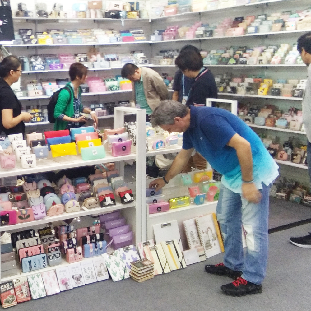
The color design of product packaging and decoration should enable customers to think of the characteristics and performance of the product. The color of the package should be a visual reflection of the contents, characteristics, and uses of the packaged goods. That is to say, regardless of the color, the content of the product should prevail. When customers see the color on the package, they can think of the goods in the package. For example, green reflects canned green beans and orange indicates orange juice. In color, this reflects the color of the product, called the image color. For example, the packaging color of snacks is generally vermilion, orange, yellow, and has the function of causing appetite.
Looking at various colors, red is used in cosmetics and food. Green tone can be used in all kinds of swimwear, water sports equipment, cold drinks, summer vests, fans, refrigerators and other goods. Blue is used for packaging of hardware machinery and electrical appliances, giving people a fresh feeling. Medical supplies can also be packaged in blue tones. Purple calls for high-end cosmetics, jewellery, gifts and packaging, giving people a sense of elegance, dignity, and elegance.
Here, this is not an absolute guideline. The design of packaging colors should be subject to the investigation of market commodity packaging. Of course, we must dare to
Innovation, breakthrough. However, in general circumstances can still learn from. Such as the winter supplies packaging, with warm colors, it will give people a warm feeling.
The packaging of summer products, with cool colors, will give people a cool feeling. The use of yellow tones to package textiles will make people feel warm.
PU Key Holder according to the function, there are simple can only put the key, there are many styles not only this function, increased multiple card, some key holder can also put a small amount of cash. Its appearance makes the future travel more convenient.
Jilin Y.F. Imp & Exp Co., Ltd is an exporter and manufacturer (Cang nan Y.F. Stationery & Gift Co., Ltd.)in Creative products, such as Backpack ,Shoulder Bag, Pencil Case , Handbag,Multifunctional Bag. Coin Purse .Cosmetic Bag.Storage bags. File Holder.Canvas handbag and Notebook etc. which is a professional stationery company setting research and development, producing, sales and trade into one. Our company always takes quality, service, efficiency and innovation as our management philosophy. Since our brand Y.F. has been put on the market, the products sell well throughout the country consistently, and be exported to Europe and America,, and South America countries as well as regions, where the product enjoys great customer loyalty and good population. Choose Y.F. is not to choose a batch of stationery, but to choose a commitment and responsibility, Thanks for your attention, support, trust an cooperation. Wish to establish long-term business relationship with you in the near future.


Pu Key Holder,Modern Key Holder,Wooden Key Holder For Wall,Metal Key Holder
Jilin Y.F. Import & Export Co.,Ltd , https://www.jilinyf.com